Project overview
Problem
Westpac’s product marketing team’s were looking for a set of landing page templates to quickly support campaign activity whilst their core website was being rebuilt on a new platform.
Westpac’s product marketing team’s were looking for a set of landing page templates to quickly support campaign activity whilst their core website was being rebuilt on a new platform.
Objective
Align Westpac marketing websites to a consistent set of templates that is flexible enough to support their wide range of product and service offerings.
Solution
Rather than taking the brief at face value, I co-lead a UX team in creating a modular design system, producing a library of consistent components that can be rapidly assembled into different campaign pages or entire websites to fulfil a wide range of needs.
The flexible component library has been consistently used across all product marketing web pages.
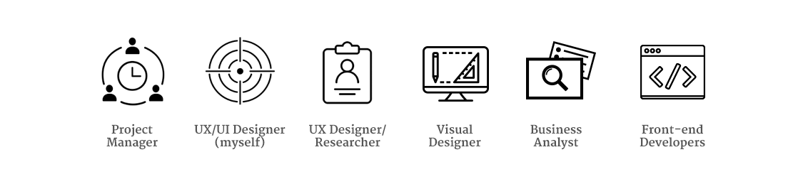
Roles and responsibilities
This project evolved over the course of a year touching many people within the experience design team. I played a hands-on role, spearheading the design system direction, producing many of the wireframes and presenting the interface documentation to various stakeholders across Sydney and Melbourne.
Design approach
Component audit
The project began with an audit of previous campaign websites to uncover common use cases. This uncovered great inconsistency in the style and behaviour of UI components..
The project began with an audit of previous campaign websites to uncover common use cases. This uncovered great inconsistency in the style and behaviour of UI components..
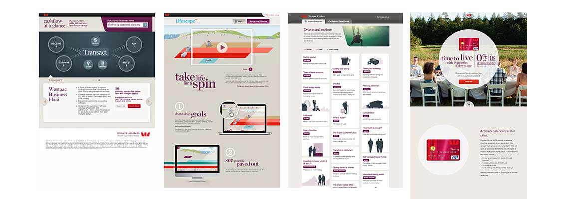
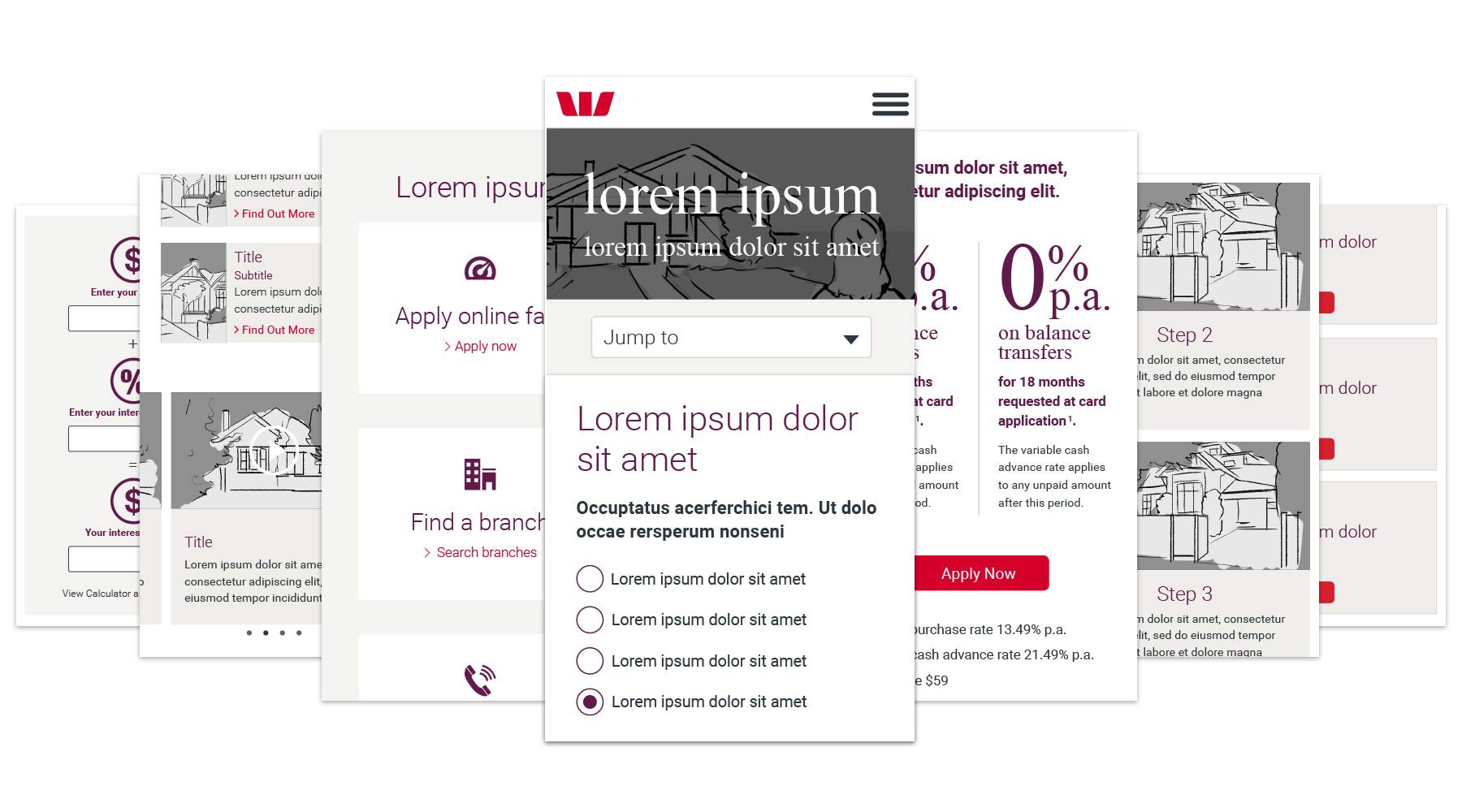
Examples of previous marketing campaign websites.
Conceptual sketches
Due to the high turnaround of the project, we worked to a lean design process. Multiple variations of each component were roughly sketched and collaboratively critiqued and refined before being designed at higher fidelity.
Due to the high turnaround of the project, we worked to a lean design process. Multiple variations of each component were roughly sketched and collaboratively critiqued and refined before being designed at higher fidelity.
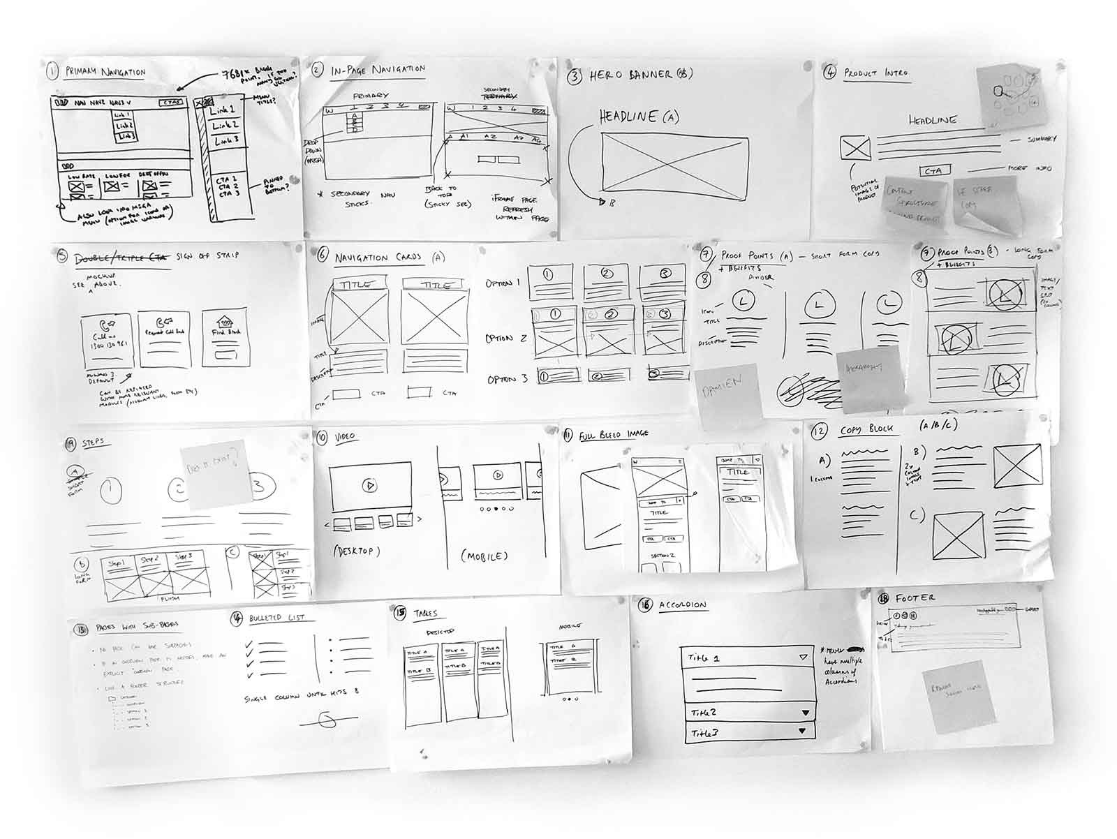
Early UI component sketches.
UI pattern research development
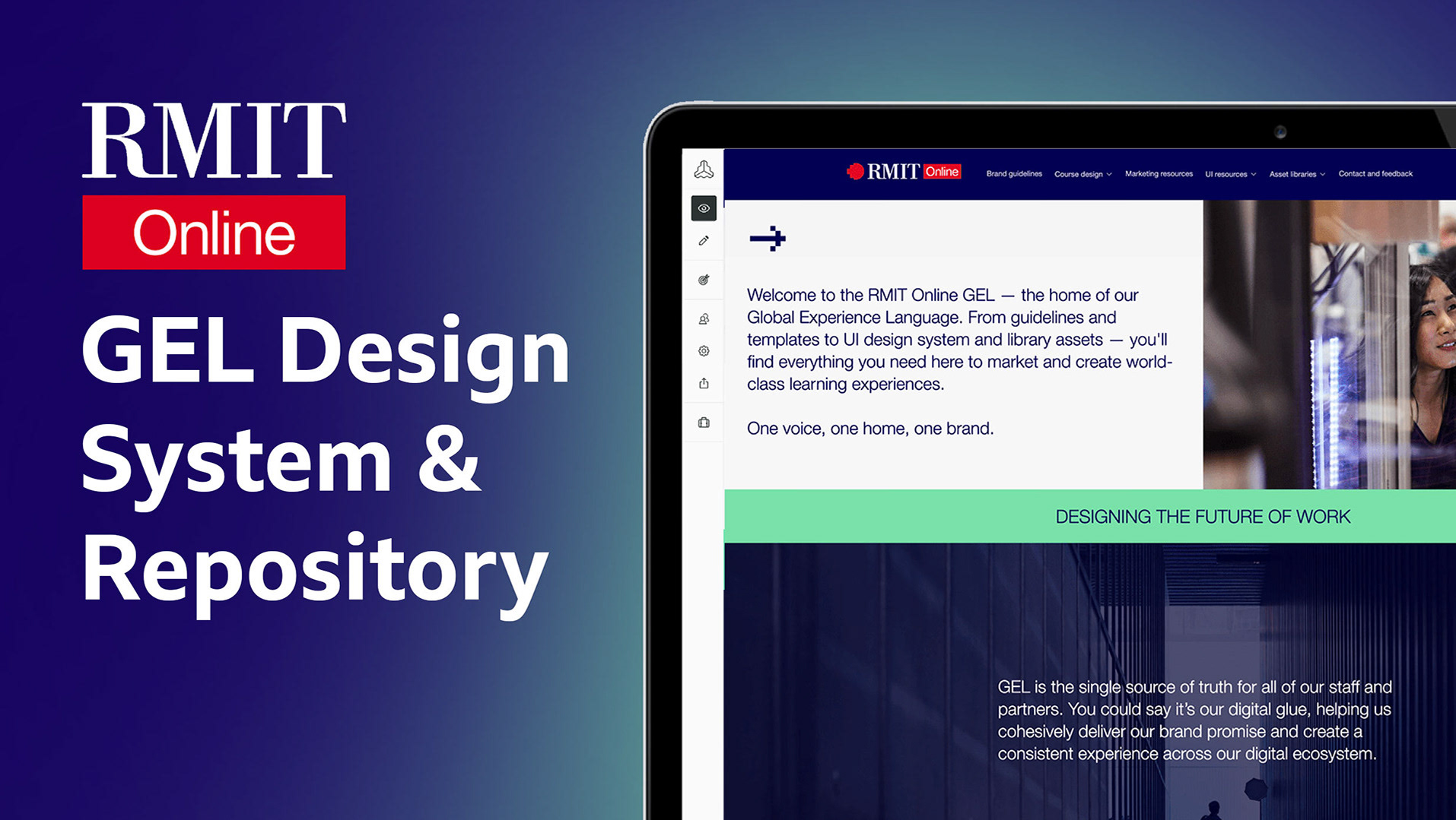
We collaborated with the Westpac Global Experience Language (GEL) team to develop a component library that synchronised with their well researched UI element library.
We collaborated with the Westpac Global Experience Language (GEL) team to develop a component library that synchronised with their well researched UI element library.
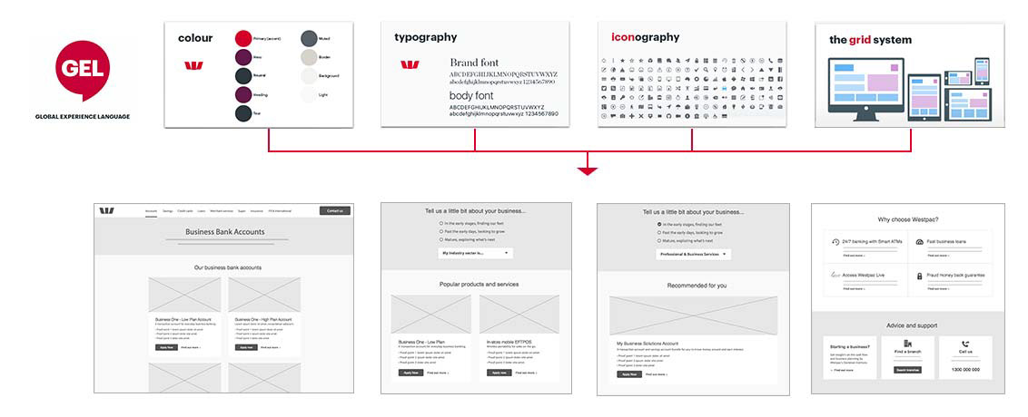
The GEL system feeds into the component library, applying styles to the UI components in real-time.
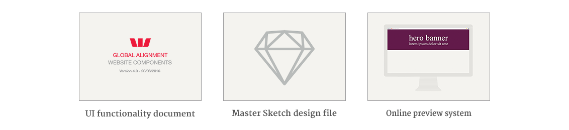
Documentation
The ever-evolving and highly custoing misable library covers many different use cases, from a multi-tiered, responsive navigation system, to the focal point placement of proof point images.
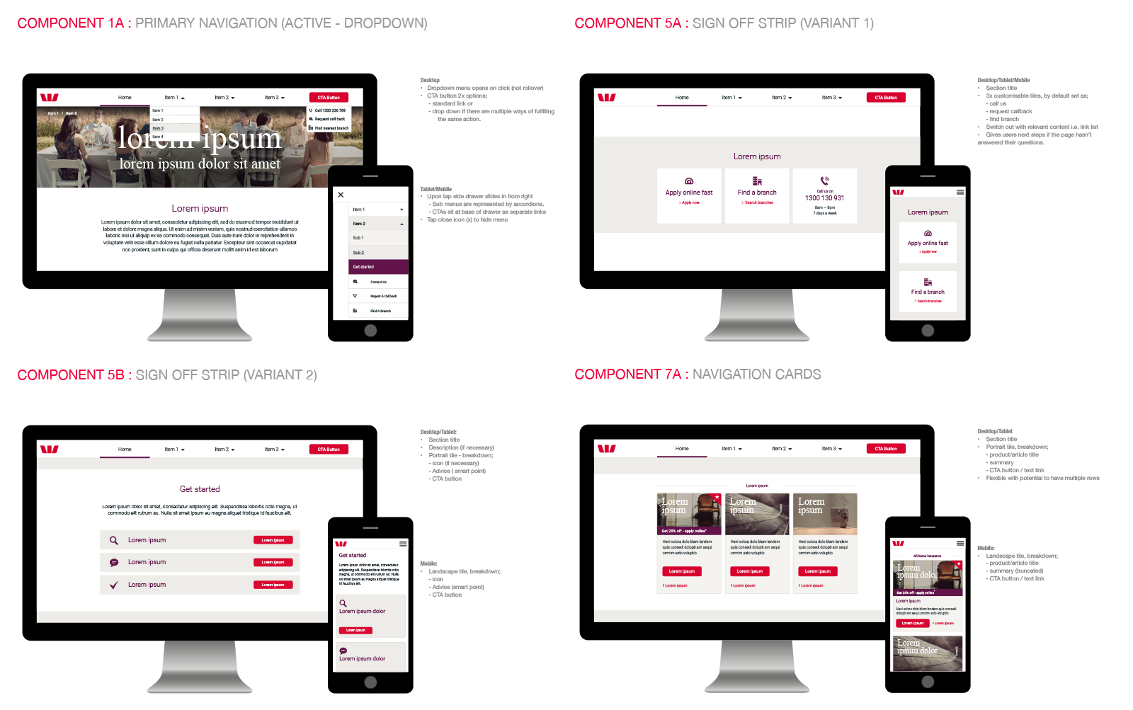
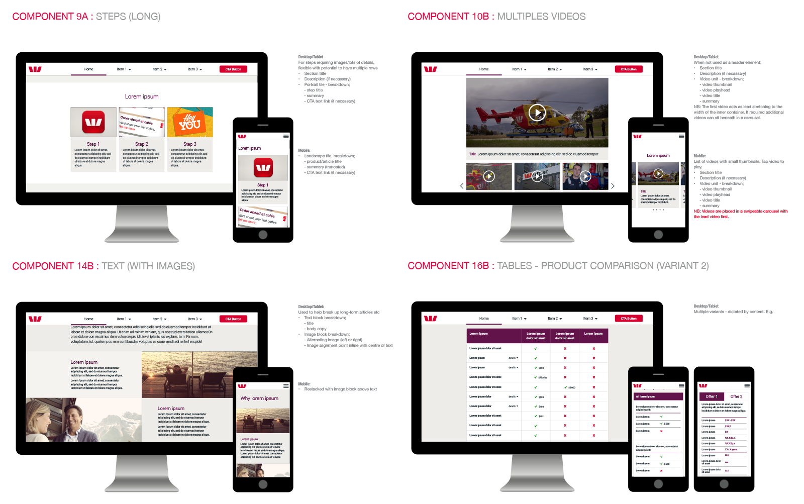
Example responsive components with functional notes.
Outcome
The original 20 component design library was launched in time for 3 major product and service site releases. I personally presented and demoed the system to both the client and Sydney and Melbourne design teams, alongside providing support and governance.
Deliverables
Consistent and efficient results
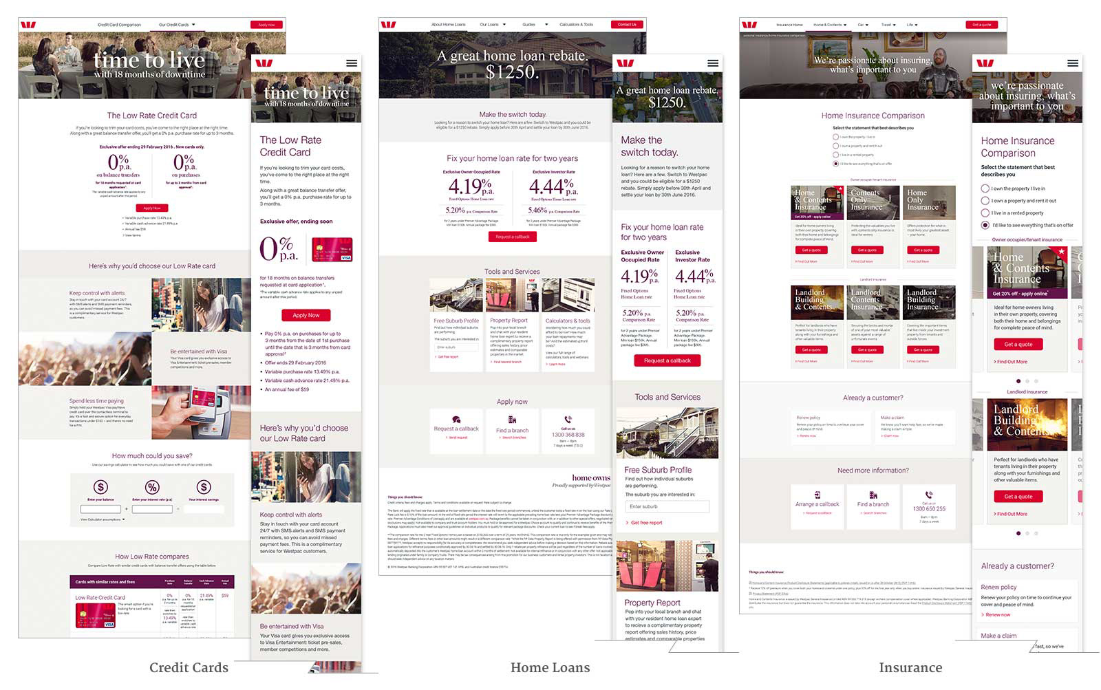
Through using components and plugging into Westpac’s GEL system, new pages maintained a consistent look and feel and could be technically maintained and collectively refreshed regardless of the product or service.

Continual refinement
With each release, new components were developed to meet new use-cases. Performance was measured by the product team, with campaign components being further refined in-line with these learnings. This insight also fed into previous and future campaigns, resulting in a constant and ongoing improvement cycle.
With each release, new components were developed to meet new use-cases. Performance was measured by the product team, with campaign components being further refined in-line with these learnings. This insight also fed into previous and future campaigns, resulting in a constant and ongoing improvement cycle.
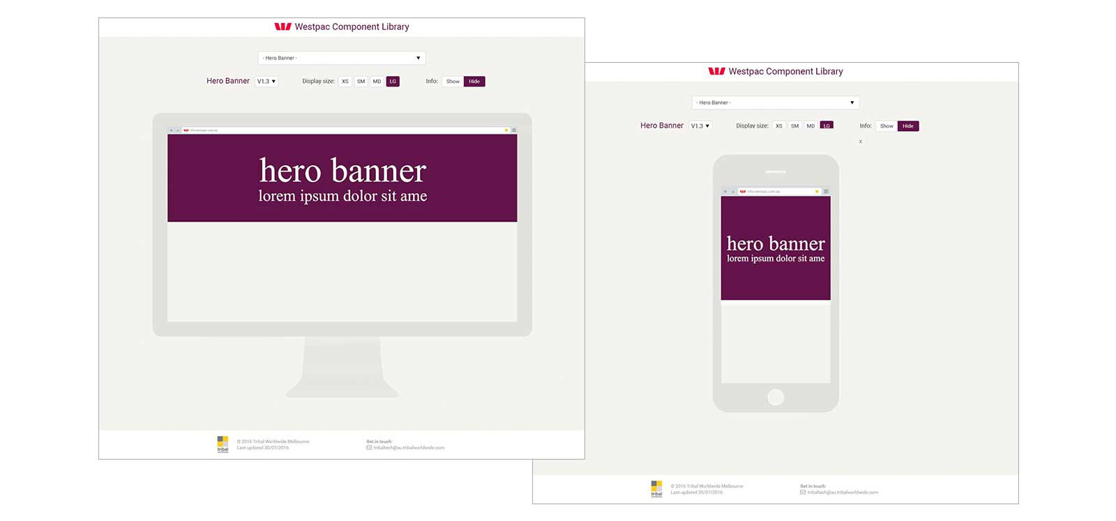
A live, online application displays a full size responsive preview of components allowing for feedback.
New learnings
To make this process possible, new workflows using modern UX and development toolkits were explored and adopted such as Sketch, Invison, Zeppelin and Note Package Manager and WebPack.
This helped to ensure there was no ambiguity between design and build and allow for automated version control of commonly used components across campaigns.
This helped to ensure there was no ambiguity between design and build and allow for automated version control of commonly used components across campaigns.
